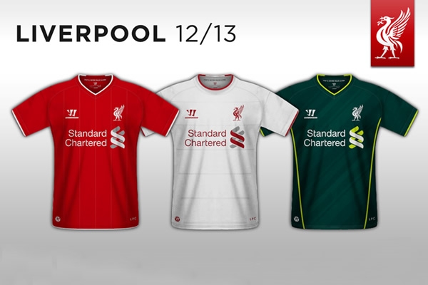
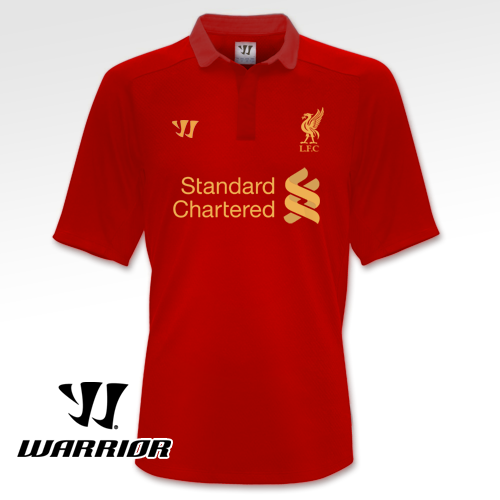
Thanks to @miguelarr90 for sending me this picture showing a mockup of our shirts.
Not sure how authentic these are but if they are I am really looking forward to the home and away retro look, the third kit one doesn’t excite me much. Many also questioned the logo with just the Liverbird without the Hillsborough flame, yes I am sure that the flame will be there, the club will not leave it out.

Thanks also to @wideawakewesley for sending me this one.


could it be possible that the 3rd kit…could be a gk shirt
no there not.. theyve been doing the rounds for months on Liverpools Kop Community.. just fan mock-ups im afriad ! theres a few like this on the same page, if i can find the link ill post it !
Class shirts… I love the third kit actually! Nice one .’)
This is NOT it… Ive seen them and the colors are wrong on 2/3….. cant tell you any more, sorry but this is NOT it.
I like the crest, bit like that of the 70’s but bigger, would not be bad if they were authentic.
If truly they next season’s jerseys, i’d say they are splufik
tbh i love all three of these shirts, its a shame if they’re not real
Plus it would be 12/14 if it was official for the home shirt anyway
Caan’t see us doing away with the eternal flames to be honest.
when do we think Warrior will actually release what the kit will look like? Can’t be in june when adidas goes as that is too late imo….. they’d want to market it before then.
beautiful, esp the green one
That second one is absolutely Beautiful!
Home and away quality shirts just what LFC kits should b red and white and love the liverbird maybe with a flame by it and LFC underneath it. Class
Well 4 me,it nice bt is warrior really better dan adidas?
Hope so….look mint!
I these are the shirts it would great to get back to a Liver Bird upon our chest. Just add the eternal flame.
Don’t like them …..please don’t get rid of the black shirts.
I got to say that I like that collared shirt.
Is warrior better than Adidas? Well thay pay more. Lfc are the 4th biggest shirt sellers it’s a loss for Adidas
Hopefully they are not. Would be an absolute scandal if the “Hillsborough-torches” on the sides of the club crest disappeared.
Except for the crest, though, it seems like a very nice kit, especially the second home kit.
Nay. Looks more like garbage.
@Ossy well maybe not in a brand sense but it will be better for us in a financial sense, because the kit deal is worth more than the Adidas one plus we have more rights over the use of the brand over adidas, netting us even more p/annum :)
beautifulllll shirts….esp the green one
..
I question the reach of Warrior sports.. There are plenty of Adidas outlets.. but Warrior?? …
Will love a Yellow away or White & Green away kit.. Maybe Purple 3rd kit too.. CLASS.
As much as I would like this to be our kit, I know it won’t be. The club will never ditch the family crest.
I have seen many fan designs and these are no different. They are very good though I must admit. They might just have the Liver bird on the front badge but the eternal flam and Shankly gates on the back of the shirt possibly?
Oh my Puki Mak, these shirts a far better that the stupid Reebok ones.
i cant see how people are upset at the end of adidas. thier kits have been tacky for some time, admittedly not as tacky as some of the reebok shirts. but still plastick looking with the diamond designs. the last couple of shirts have been the same as the other generic adidas kits (which i almost like) but they decided to put an extra flash of white, or that rubbish collar in 2007 or it might have been 2008. i am a massive liverpool fan but i am happy trawlling ebay for quality classic shirts over spending nigh on £50 on something designed to last a couple of football games that looks so poorly made. that bieng said. if the next kit looks good ill snap it up no bother. fingers crossed
OK, fake or not, i love them designs, can’t wait to get my hands on the golf shirt one. Roll on 2012/2013.
Dont like the red shirt on the pic of 3 diff tops reminds me too much of man utd with that black trim on the v neck but the red top underneath looks good
Whether they’re the actual shirts or not, I really like the home and away kits but the third kit, while not bad, looks a bit like the Springboks rugby kit!
my guess is that with warrior having it’s first appearance at such a huge level of competition, that they’ll be making sure their designs stay under wraps. secondly I can only assume they’ll be more creative than these three.
What kinda design is that,retro??,Looks awful more like a T shirt than a jersey,CRAPPPPP……S
I don’t think they are, the crest is missing, although I do like them. fake if you ask me
Cetainly look good lits but no way that will be the badge. It would be a great sign of disrespect to those of Heysel and Hillsborough if the flames are left out and also a bad move to remove the shankly gates and YNWA from the badge. So I do think these are just made up by some clown on the internet, especially considering our new Yank owners are PR based they would not get rid of three great elements to the badge, it would be disastrous PR
The 3rd kit? Hmmm… Looks like the Australian strip lol
I saw in another pic that the crest had 5 stars on it. i think incorporating the european stars will be a nice touch :)
They are fantastic and I like them a lot. Good deal for LFC!!! Adidas gave us a lot of stick because of the deal but IMO it was all sour grapes. They never mentioned that we are the second most selling club as regards to football shirts in europe.
THE COLLARED SHIRT IS THE BEST BY FAR,(second picture!)
they are very nice
I disagree with comment saying it would be disastrous to get rid of the Shankly Gates on the badge, Liverpool should be about the future not the past, the badge Shankly inherited in 1959 was a straight Liverbird, I would be delighted if Liverpool went back to the straight Liverbird badge. It is plainly obvious to anyone worth their salt that the eternal flame would never be removed without the families blessing, I personally believe that it should never be removed from our shirt, but maybe in time it could be moved to the arm, but not until justice for the 96