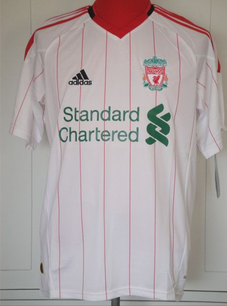
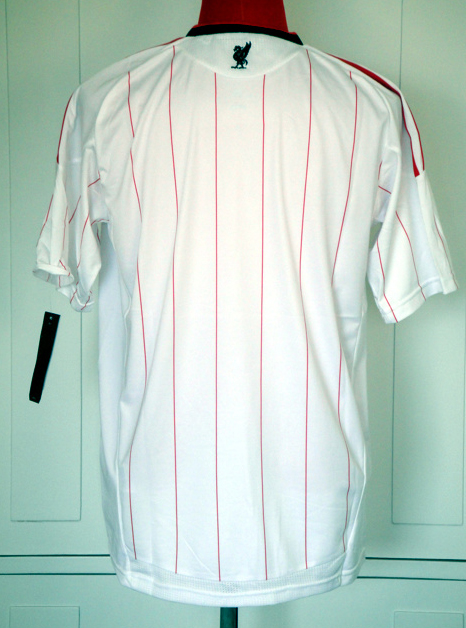
Another picture of a ‘Liverpool Shirt’ just appeared on the internet, thanks to @AMG133 for submitting this,
It was found on a German website so maybe someone with some inside knowledge at Adidas?


Another picture of a ‘Liverpool Shirt’ just appeared on the internet, thanks to @AMG133 for submitting this,
It was found on a German website so maybe someone with some inside knowledge at Adidas?
This one does have the climacool and Adidas bubble logo at the bottom, so best one we have seen so far.
Although the bird on the back doesn’t look quite right and neither does the club badge.
In any case,if its the right one,it’s ugly im afraid.
but i dont rly think its the right shirt..we’ll see!
the liver bird has grown fatter??
it looks very much like the 1 they had in 82 it look like a retro shirt but with todays logos on it.its not bad needs tweeking a bit though…
Is that Rafa on the back?
i hope this is not it, its pretty ugly..
what happened to carlsberg?
Not too bad – but I would drop the red lines on the front and go for a plain block white.
I’m sure we’ll see a few more ‘maybe’ shirt designs before the real thing is launched.
@hamzy, you are ever so correct.
and it’s not that pretty either…
I hope this is a fake,really dont like it.
Looks terrible but could be good with a couple of changes.
Green sponsor logo should be red.
Crest should be changed to just the classic Liverbird.
Simples.
It doesn’t look better than the one I had seen before.
It is hideous. Potentially our ugliest one ever. Not good for shirt sales – how is that good for an ailing pool?
@Jono Carlsberg contract with us has ended, and alot of football leagues are starting to ban alcohol sponsering of teams… With this bank sponsering us though, we made a record deal for I thinkkkk £81 million. Maybe it will help a bit?
Anyways, this looks fake, and it looks aweful… Won’t be buying if it’s the new top!
I’d put good money on that being a fake. The Logo on the front is too big for a start, the Standard Chartered logo will be smaller and in a block if the shirt is patterned. The logo on the back looks a little suspect also. Like my old school reports used to say: Good attempt, must try harder.
Its Dreadful reminds me of me Grandads pyjamas!!
I’ve worked in sportswear design and I’m telling you now this isn’t the kit Liverpool will be wearing next season. Trust me.
Looks about right, now CL or EUROPA patches on it.
Just wait for the launch folks. None of this is important anyway just concentrate all your positive thoughts on willing the lads success in their pursuit of forth spot and Europa League success.
This might be a prototype or mock up of the actual thing. Black adidas logo should be red. I actually quite like it. Anything is better than last season’s grey, they were dreadful.
I also just noticed that the center of the collar is a bit off.
Not the shirt is important. The results are.
@Amanda well said there! Put your hand in your pocket and buy the shirt when it comes out, might reduce the debt haha. But, funny how this gets more comments than the “news” on here, lets worry more about the games we have ahead of us!
have seen this shirt before and it had your will never work alone on the inside so im not sure that its real.
honestly it realy does say it check around and you will see unbelievable
I hope not
Whatever be the Shirt we need the Cup next season..To even the Manc’s if they win it this time…we need to do that, even with the worst shirt or no shirt ..whatever..
I like it!
makes me think of baseball. it looks a little odd but it doesn’t matter that much, so long as they play well!
looks like a good old fashioned ‘thai’ fake to be honest
They actually got the pictures from me. ;) http://www.colours-of-football.com/forums/index.php?s=&showtopic=9706&view=findpost&p=169059
I can assure you THAT shirt is a fake made in Asia, but the real thing will look just like it (sponsor logo colour tbc however) but of better quality.
They follow the style that was originally leaked http://www.footballshirtculture.com/10/11-kits/liverpool-2010-2011-adidas-football-shirts-leaked.html
classic design back to the 70s good shirt yellow with red stripes would have been better though
According to a few decent sources at RAWK this is actually the kit that will replace our current away kit. But this does look like a prototype as they have changed the badge and got rid of the horrid green in the crest and replaced it with all red with the flames burning yellow and orange to stand out for Hillsborough.
I think it’s quite nice really, nice retro vibe to it, looks like an old kit, shame we can’t banish the sponsor from the kit.
It is nice enough, didn’t like the home one at first but it’s grown on me, the marseille top is nice, I think I’m gonna get it instead
I don’t think so